 Migrain Analysis
Bright colours such as yellow, orange and blues are used. These colours all represent and connote summer. This links well with the magazine as it’s a summer feature. ‘Get summer and Sexy in just one week’. The loud colours used could reflect how women should be feeling as summer is a happy season.
G- Print advert
I- the front cover is there to attract females attention. It is there to prove that a patriarchal society no longer exists and that women are now equivalent to men. Articles such as ‘8 new places to have sex’ and ‘orgasms unlimited’ convey the message that women are no longer inferior to men and that they are allowed to enjoy activities that men would take pleasure in such as sex. The magazine is also a source of knowledge as its there to inform, and educate women about life it self.
Film posters
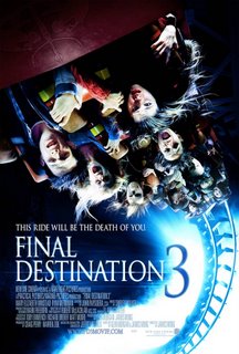
M- The image is of a rollercoaster, long shot in order for the viewers to see who is in the film and possibly how many characters there will be in the storyline. The image isn’t pleasant, as it illustrates people suffering and frightened. This here creates an enigma as it allows questions to build in the viewers mind about how did the characters get into this dilemma in the first place? Is the main storyline based on the rollercoaster?
I -Hollywood mainstream, directed by James Wong
G- Horror, Hollywood film
R- Final destination 3 stereotypically represents a group of teenagers who go out to a theme park and sit on a rollercoaster which is built to kill them all one by one. It represents teenagers.
N- A clairvoyant high school senior (Winstead) has a premonition of a fatal roller coaster accident at an amusement park that involves her and her friends. Her vision prevents her and her friends deaths, but the unseen forces of darkness once again set out to kill the survivors that were supposed to die in the freak accident.

The Sun
Technical Code:
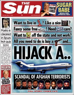
Son serif font is used. This is usually associated with being informal and laid back. The head line is bold and big, which again catches the readers’ attention. The headlines have images as well as word creating a pictionary affect. This goes well with the informal ness of the paper.
The image of the plane is big and in the center with HIJACK written along side it.
Other images of people who might be responsible for this crime are printed on the front of the paper as well as pictures of footballers that are included in the other articles displayed.
The photographs relate to the story as the story is about the plane being hijacked. However the pictionary words are there to mock the whole idea of the Afghan terrorist not getting what they want, and they believe by hijacking the plane will resolve everything.
Written code:
The other images such ‘ Sponge bob’ and the picture of the ‘gun’ signify informal ness and show portray comedy through the stories which makes the readers seem if they take the news seriously.
The typical conventions used are, the masthead, captions and puns. Also the way bits of the story are previewed on the front page influencing the reader to read on and purchase the newspaper.
The masthead and the title signify importance of the newspaper. It’s a red top newspaper and that is reinforced by the usage of the colour red in the masthead.
Specific colours are used to create an impact. For example, the colour blue is there to represent the sky, as the plane was hijacked while it was in the air. The colour used can also be ironic as blue has connations of calmness. Here they have juxtaposed a chaotic situation against the colour, creating emphasis on the story.
Front page overall:
The overall layout of the front page is good as it coveys the right message. It’s satirical, however, it allows the consumers to think and release that what the Afghan terrorist did was pointless and cruel as many innocent people died. The masthead and headlines are brought out bold and at a reasonable size in order for the readers to see and read it. The font suits the tabloid and poisoning of the articles are comfortable as its more easier to read. Not much text is seen in the front page, this is seen as good as it keeps the reader intrigued and to read on. The quality of the images are excellent and at a good size as it topics the whole newspaper and gives an idea if what the actual paper consists of. The images are polysemic.

